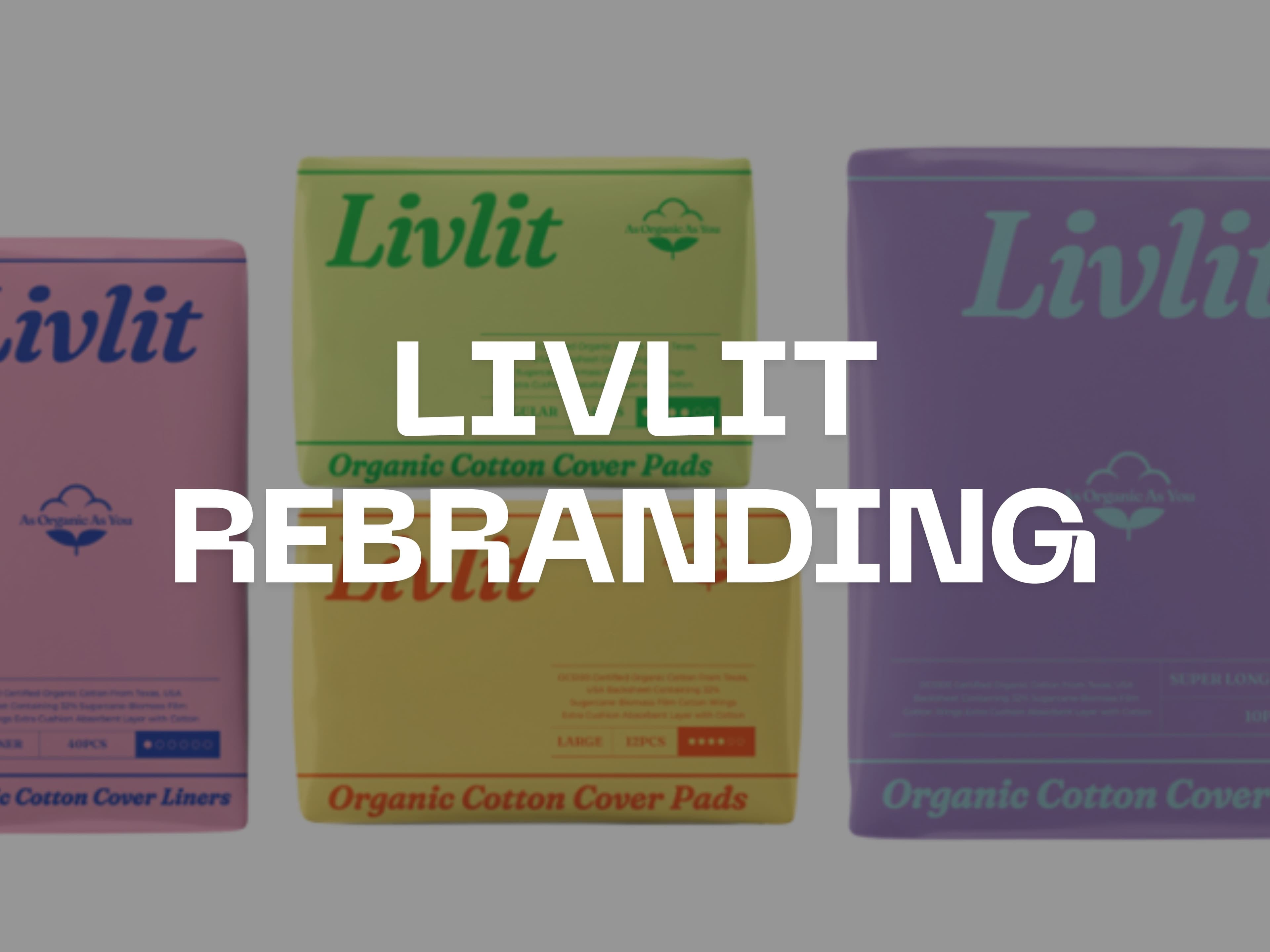
LIVLIT: Brand Renewal Project Targeting the Young Generation
Project Details
LIVLIT: Brand Renewal Project Targeting the Young Generation
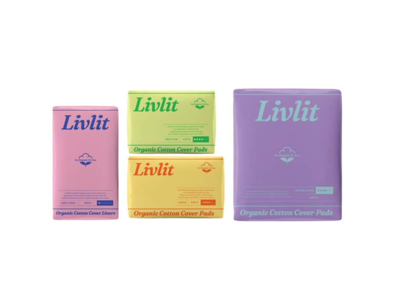
To accelerate growth in the U.S. market, LIVLIT’s brand identity and design were renewed with a playful and kitschy tone. We refined the brand logo and color system to ensure instant product recognition in digital environments, enhancing visibility and click-through rates across thumbnails, feeds, and ad placements.
The key challenge was to retain the brand’s legacy tone while shifting its language and visuals to resonate with younger U.S. consumers. MINT PUBLISH redefined media usage patterns and category reference maps for the core target audience, then repositioned the brand character toward a lighter, more playful direction. We refined the logo’s shape, weight, and spacing rules, and designed a high-saturation, high-contrast color palette to make the brand pop even on small screens.
To strengthen online recognition, we developed a dedicated thumbnail layout guide that fixed the proportional placement of the product package and logo, set typography sizes for distant readability, and modularized the system to apply consistently across Amazon PDP and A+ content, DTC stores, and TikTok/Reels vertical videos. Key visuals and color codes were differentiated by SKU to enable quick distinction in list and grid views. We also added shooting and motion guidelines (intro timing, subtitle frame rules) to ensure a consistent brand tone even in influencer-generated content.
In communication, we incorporated youthful speech patterns and rhythms, streamlining message length and hook structure. Product features were compressed into single sentences, and key phrases were placed in the first frame to maximize attention in both paid ads and organic exposures. ALT text and meta copy templates were also provided to strengthen contextual delivery in search and answer engine environments.
This project established a unified toolkit connecting logo, color, typography, packaging, and content guidelines, creating a cost-efficient foundation that can be applied to future SKU and category expansions.
Gallery
Related Clients
SSK (LIVLIT)
LIVLIT is a premium feminine hygiene brand based on 100% organic cotton. It is securing its position in the US organic feminine product market by offering a differentiated value proposition in the women's health and lifestyle category.